
Chart of the Week

The chart illustrates the outperformance of growth stocks relative to the broader U.S. market index, the S&P 500, since 1926. Growth stocks cannot rise indefinitely. Historically, there have been two peaks—1970 and 2000 during the tech bubble. We are now once again at similar valuation levels.
Why this matters
Growth stocks largely drove returns in the U.S. in 2020 and 2021. However, a correction has been underway since November 2021. The question many investors are asking is whether growth stocks, especially after last week’s sharp pullback, now present a good buying opportunity.
The chart above suggests that we may be seeing a trend reversal that could unfold over several years. Growth stocks are often highly leveraged or not yet profitable, meaning they rely heavily on debt financing to fund their operations. Higher interest rates hit these companies particularly hard.
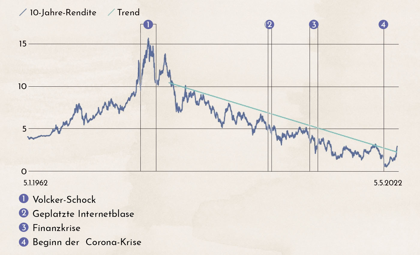
The chart shows U.S. interest rates since 1960. The more than 30-year trend of declining rates now appears to be broken. It is therefore likely that growth stocks will continue to correct, while value stocks may now be the better place to invest.
Nervous markets: earnings season has ended
Financial markets had largely moved past the Ukraine crisis and refocused on the current economic environment of high inflation and rising interest rates. However, increasingly aggressive rhetoric from Moscow and uncertainty around what Putin might say on May 9, Russia’s Victory Day marking the defeat of Nazi Germany, are now creating renewed uncertainty.
The U.S. Federal Reserve’s decision to raise interest rates by 50 basis points was widely expected. Still, following the negative GDP growth figures released the week prior, some market participants had anticipated a less aggressive signal from the central bank. The risk that the Fed may raise rates too aggressively and push the economy into a recession is increasing.

The chart shows the performance of the U.S. equity market 52 months before and after the first rate hike by the central bank since 1994. The thick blue line represents the current development, while the lightly shaded gray lines show the patterns from the last four rate-hiking cycles.
The current correction is already the strongest among the past five cycles. Of course, previous cycles were not overshadowed by a war. Nevertheless, the chart suggests that the market reaction, purely based on central bank rate hikes, may already be overdone. If the negative impact of the Ukraine crisis begins to ease, a rebound in the markets can be expected.
The earnings season, which is now coming to an end, with companies reporting their results for the first quarter of 2022, was relatively positive. However, corporate guidance did not help to break the negative bias described above.

The chart shows investor expectations before the end of each quarter and how earnings were actually reported. The last seven quarters are highlighted in color, along with the next two through the end of 2022.
At the start of this earnings season, average earnings growth of 5.5% was expected for U.S. companies. The actual figure came in at 8.7%, with 81% of companies reporting results above expectations.
This is, in fact, a very strong picture. However, some negative high-profile cases, such as Netflix, have weighed on investor perception. Market sentiment is currently so negative that good news is largely being ignored.
The outlook for the coming quarters is also encouraging. For the second quarter, only 5% earnings growth is expected—again, many companies may exceed this figure. Expectations become more ambitious for the third quarter of 2022, with a projected increase of 10%. Given the sharp decline in Americans’ disposable income due to high inflation and rising mortgage rates, this target may be more difficult to achieve.
Commodities: Is it too late to invest now?
Commodity prices have risen sharply in recent months. We attempt to place this price increase into a historical context.
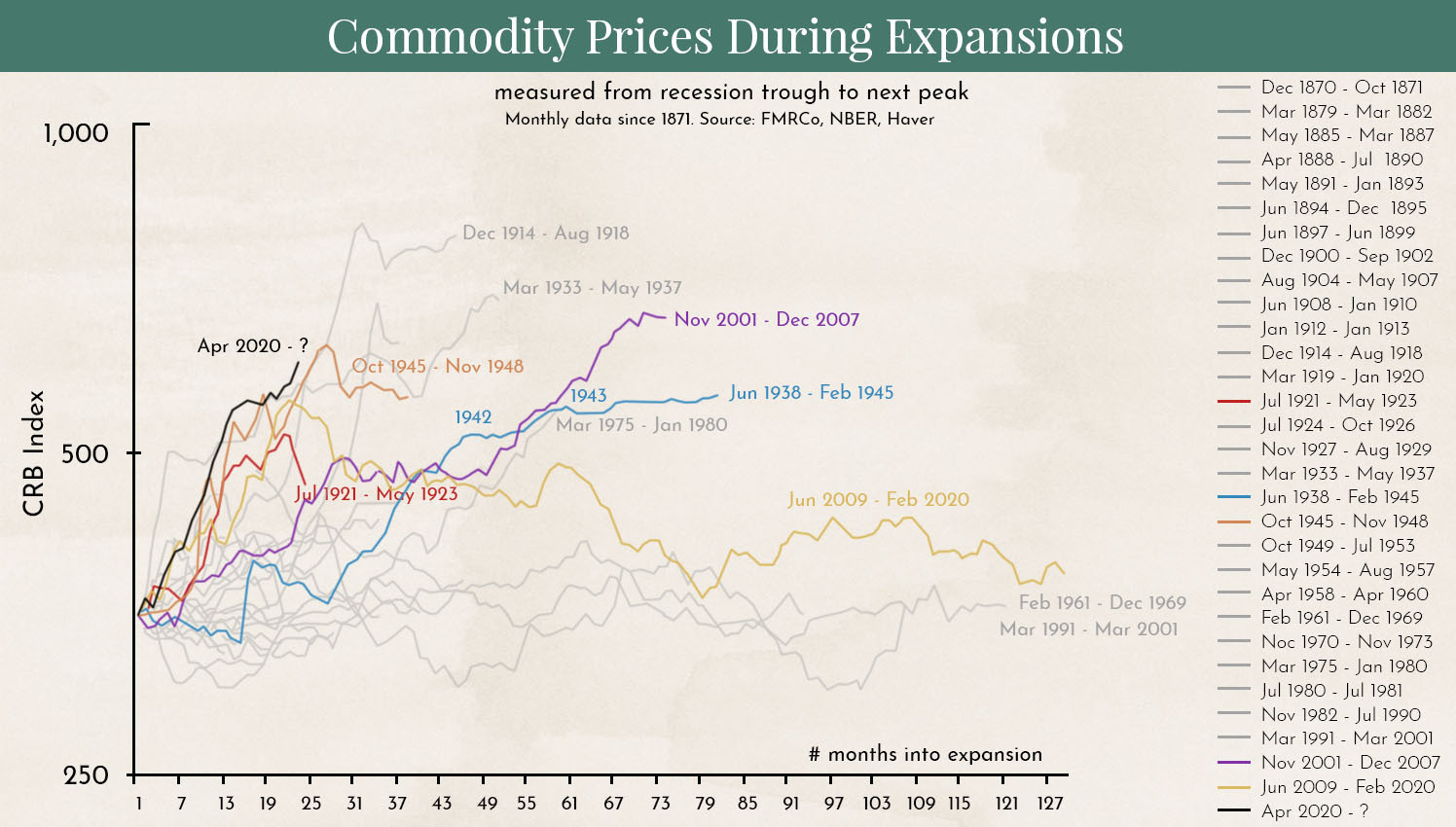
The chart shows the performance of the broad CRB Commodity Index during economic recoveries since 1873. From a historical perspective, the current surge is one of the largest on record. Only a few times has the increase continued further and reached even higher levels.
The current rise is being driven by post-COVID supply chain disruptions and the war in Ukraine. Nevertheless, a comparison with the past suggests that the largest part of the increase may already be behind us, and that we could be nearing the end of this upward trend.
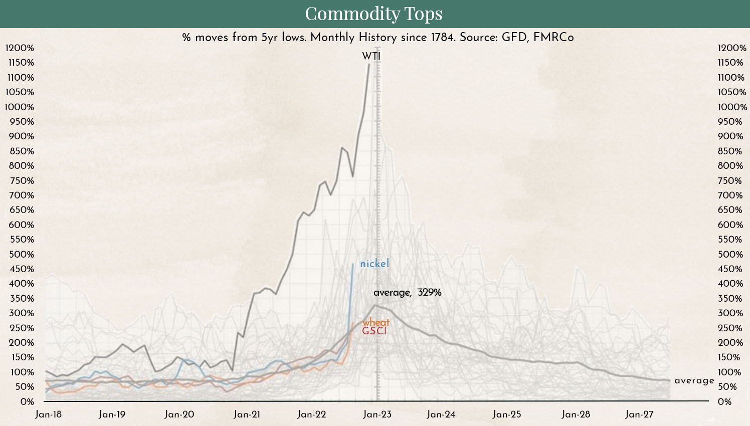
The chart shows the price increase of selected commodities (in color) and the broad S&P GSCI (in black). The gray shading represents the returns of individual commodities during recoveries from a 5-year low since 1784.
The current rise in commodity indices has been driven primarily by the surge in oil prices. We are currently seeing the strongest increase in oil prices following a 5-year low since 1973. Many governments are intervening in the market by reducing taxes on energy and releasing supplies from strategic reserves. We believe this could sustainably curb the rise in oil prices.
The outlook is more challenging for other commodities, particularly wheat, where further price increases are likely.
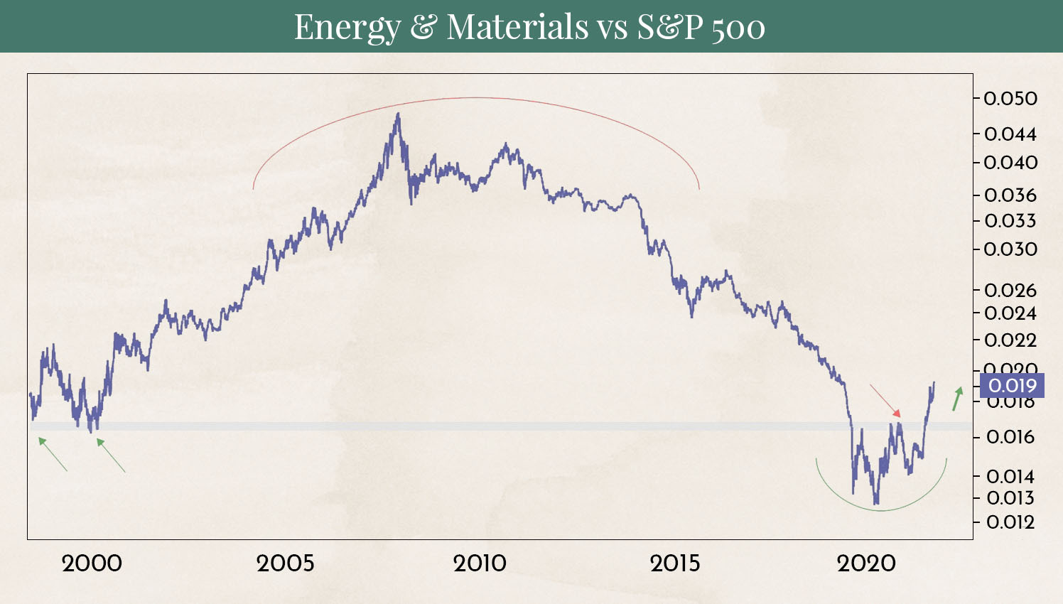
The chart shows the outperformance of energy and commodity companies relative to the S&P 500. It highlights how long-term commodity trends typically are, often lasting 8–10 years.
Following a steep period of outperformance from 2000 to 2008, there was a prolonged phase of underperformance from 2008 to 2020. With the trend now having reversed, there is a strong chance for a sustained period of outperformance in this sector.
Due to the significant short-term movements described above, we currently expect commodity prices to consolidate somewhat. However, the likelihood is high that they will resume their upward trend after a few months.
Disclaimer:
The content in these blog posts is provided solely for general informational purposes and is intended to help potential clients gain an understanding of how we work. It does not constitute recommendations to buy or sell any assets and does not represent investment advice. Marmot Finance cannot assess whether or how the statements made align with your investment objectives or risk profile.
If you make investment decisions based on this blog post, you do so entirely at your own risk and responsibility. Marmot Finance cannot be held liable for any losses that may arise from the information contained herein.
The products mentioned are not recommendations but are intended to illustrate how Marmot Finance works and selects such products. Marmot Finance is fully independent and does not earn any compensation from product providers.

.webp)


.jpeg)


.webp)
.jpeg)
.webp)

.svg)