
Chart of the Week
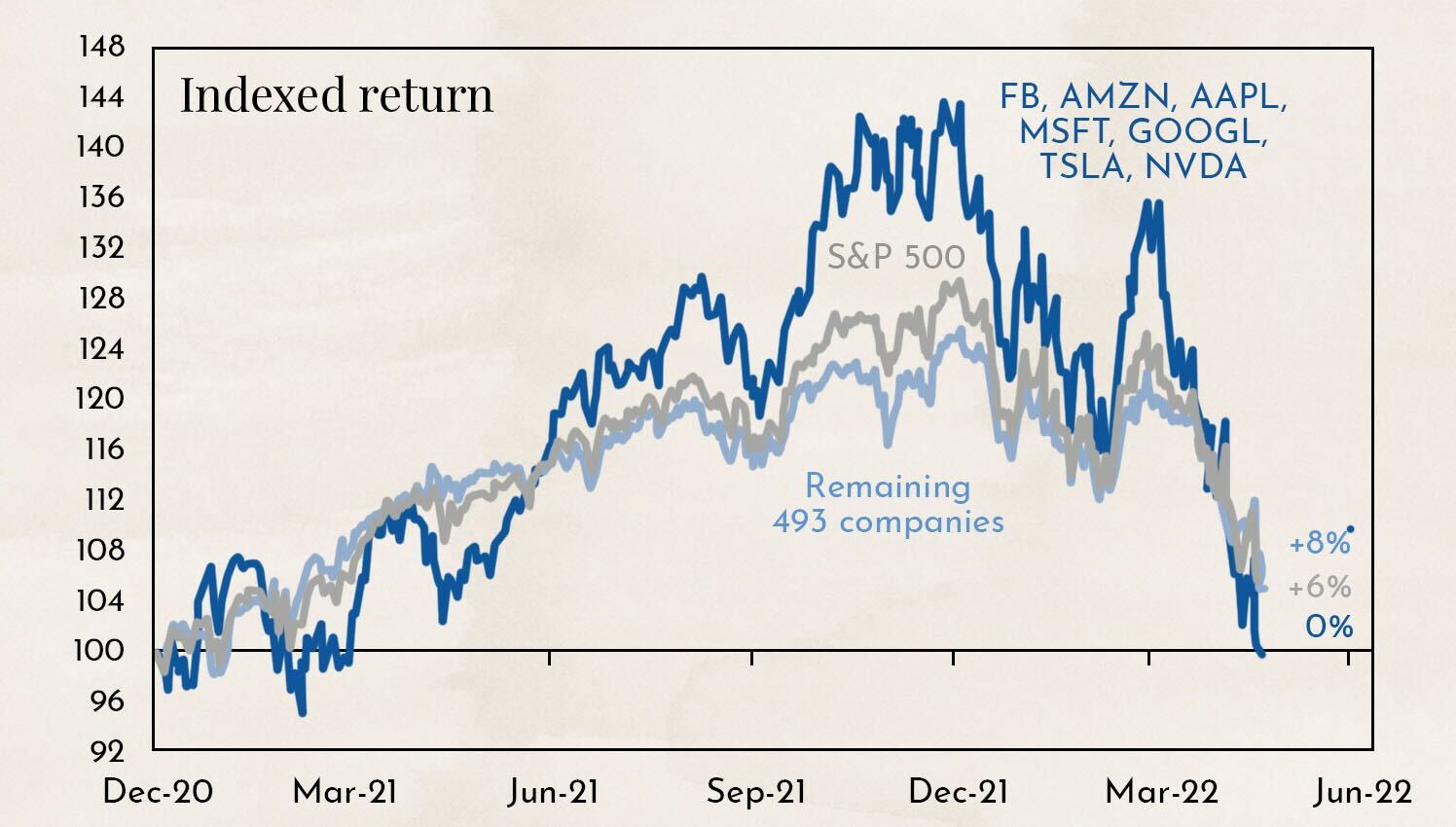
The chart shows the performance of the broad U.S. market index, the S&P 500, with and without the largest and most well-known technology stocks since 2020.
Why this matters
The U.S. market is heavily driven by a handful of well-known stocks. In 2021, any investor who was invested in Facebook, Amazon, Apple, Microsoft, Google, Tesla, and Nvidia significantly outperformed the market. In 2022, the opposite was true. Those invested in these seven stocks had to endure substantial losses.
A broadly diversified portfolio is essential. In 2021, advocates of diversification were penalized, but in 2022, they were ultimately proven right. Only broad diversification protects against significant losses.
Negative sentiment is normalizing
The correction since the beginning of the year has been painful, but not entirely unexpected.
.jpeg)
We already showed this chart last year to illustrate how far U.S. stock market valuations had diverged from reality. The chart compares the development of transportation and delivery volumes in the U.S. with the broad stock market index, the S&P 500. The broader market generally follows the physical expansion of the economy, which can be seen in the volume of goods being transported. Even in the internet age, goods still need to be physically delivered to customers.
The situation now appears to be gradually returning to pre-COVID levels. Momentum is fading in the stock market, while transportation volumes are increasing. However, the process is not yet complete.
.jpeg)
The chart shows the development of the price-to-earnings ratio (P/E) of the U.S. stock market. The P/E ratio serves as a benchmark for company valuations. If an investor were to acquire a company, they would currently need to wait 17 years for the investment to generate enough earnings to repay the original amount invested. The valuation has fallen from 23 earlier this year to 17 and is now already below the average of the past 10 years.
.jpeg)
The chart shows the magnitude of changes in the P/E ratio since 2007. The decline in the P/E ratio has been faster and more severe than during the financial crisis or the COVID crisis. For us, this is a clear indication of an overreaction and highlights the significant panic in the markets.
.jpeg)
The chart shows how financial analysts have revised their earnings estimates for U.S. companies over recent weeks and months. Estimates were revised downward across all regions, with the revisions in the U.S. being significantly below average. Even financial professionals were swept up by the panic sentiment.
From a fundamental perspective, it was therefore clear that the recent correction had gone too far and that a rebound was bound to occur sooner or later. There is a well-known stock market saying: “Never catch a falling knife.” In other words, one should not try to buy an asset during a sharp decline. It is wiser to wait until it hits the ground, at which point it can be picked up safely. To help determine that timing, investors often turn to technical market analysis.
Bear market rally begins
.jpeg)
The chart shows the price development of the technology index, the NASDAQ. This index includes the major technology stocks that led the market decline in recent months. The price has now reached the lower end of the downward price channel, where a rebound often occurs. Additional technical indicators such as the RSI (Relative Strength Index) and the MACD (Moving Average Convergence Divergence) also suggest that, with a high probability, the knife has now hit the ground.
.jpeg)
The chart shows the performance of the Euro Stoxx 50. From a technical perspective, the picture here is even more positive. Not only have we broken above the downward channel, but we have also laid the foundation for a new upward trend.
But caution is warranted: even if the NASDAQ gains 15%, we would still remain in a downtrend, or bear market. That is why the current price movement is referred to as a bear market rally — an upward move within a broader downtrend.
.jpeg)
The chart shows how sharply bear markets have corrected since the Second World War during transitions from economic booms to recessions. A definitive trend reversal is possible, but unlikely. It would be the bear market with the smallest market decline since 1946.
.jpeg)
This chart also shows bear markets since 1946, but instead of market losses, it focuses on the duration of the corrections in days. Here too, the current correction is among the shortest.
Our conclusion: investors can now enjoy the gains from the upcoming market rally, but should avoid becoming overly optimistic. There is a high probability that the correction is not yet over.
Disclaimer:
The content in these blogs is intended solely for general informational purposes and to help potential clients gain an understanding of how we work. It does not constitute recommendations to buy or sell assets and should not be considered investment advice. Marmot.Finance cannot assess whether or how the statements made align with your investment objectives or risk profile. If you make investment decisions based on this blog post, you do so entirely at your own risk and responsibility. Marmot.Finance cannot be held liable for any losses that may arise from the information contained in this blog post. The products mentioned are not recommendations but are intended to demonstrate how Marmot.Finance operates and selects such products. Marmot.Finance is completely independent and does not earn compensation from product providers in any form.


.webp)





.jpeg)




.jpeg)

.svg)


