
Chart of the Week

The chart shows which phases of the Chinese zodiac deliver the highest returns for the US stock market. The blue bar represents the average return since 1950, and the yellow dot indicates the highest return ever achieved.
We are now entering the Year of the Dragon. Impressive as the dragon may be, returns during the Year of the Goat or the Ox have been significantly stronger.
Why This Matters
At least once a year, we warn about spurious correlations in this market report. These are seemingly perfect relationships that make no rational sense. Yet time and again, a large number of investors fall for them.
In addition to the chart above, here are some examples:
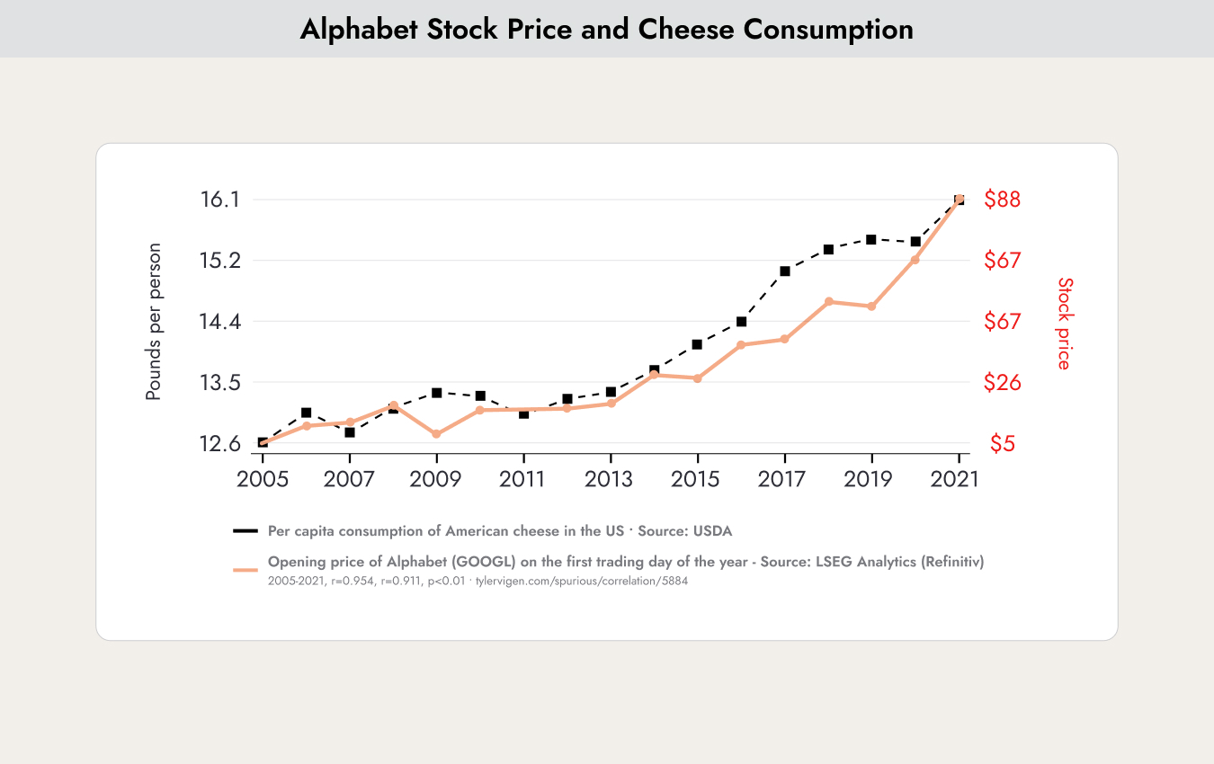
The chart shows the perfect correlation between margarine consumption in the United States and the stock price performance of Alphabet, the company that owns Google.
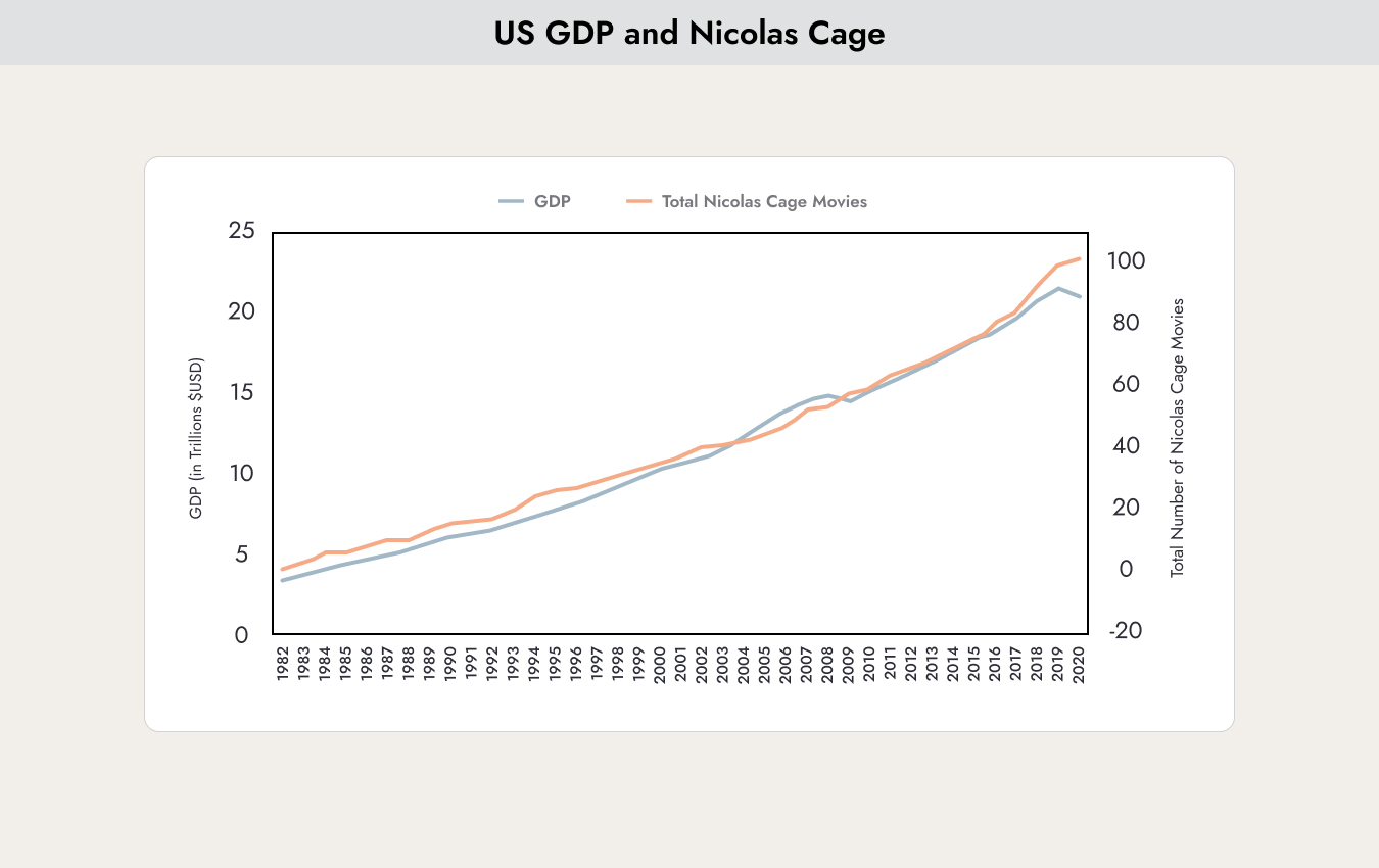
No discussion about spurious correlations is complete without actor Nicolas Cage. The classic example is the near-perfect correlation between the number of Nicolas Cage films and the number of people who drown in their own swimming pools each year. One can debate Nicolas Cage’s acting performances, although his latest film, Dream Scenario, is worth watching. That is why we have decided to take a more positive perspective here.
If you add up all the films Nicolas Cage has ever made, the result is an almost perfect correlation with the growth of US gross domestic product. We hope Nicolas Cage continues making many more films ;-)
But to conclude, let us return to the stars:

The chart shows that over the past 90 years, investors would have achieved significantly better returns by investing in the S&P 500 only during New Moon phases. Very impressive, but one must remain disciplined. This relationship cannot be explained.
Conclusion: If you search long enough, you will always find perfect correlations. We strongly advise against using them as a basis for investment decisions.
For every chart we use, we therefore always ask ourselves whether the relationships being presented can be explained rationally.
Outstanding corporate results – no sign of a recession.
So far, 78% of all S&P companies have reported their earnings and provided forecasts for the course of the year.
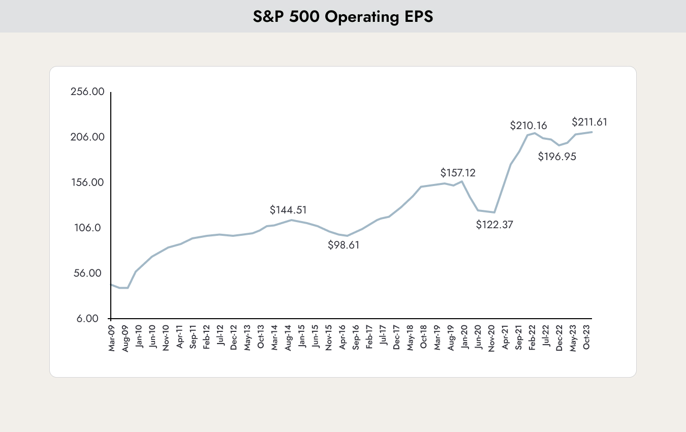
The chart shows the operating EPS (operating earnings per share) of the S&P 500. It is already clear that a new record will be reached.
The inconspicuous goat defeats the imposing dragon | Marmot Finance
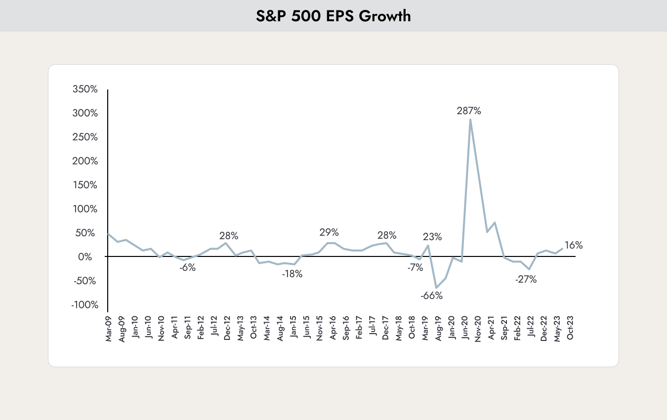
The chart shows the growth rate of earnings per share for the S&P 500. With an increase of 16%, the outlook here also looks excellent. Companies in America are doing well, and the overall economy is booming. So far, there are no signs of a possible recession.

The chart shows the expected earnings by sector based on the S&P 500’s valuation metric, the forward P/E Ratio (blue), compared with the 25-year average. All sectors except Energy and Utilities are above the average of the past 25 years, with further earnings growth expected.

Our biggest concern at the moment is market breadth. The market is being driven higher by only a very small number of companies — the “Magnificent 7”: Apple, Microsoft, Alphabet (Google), Amazon, NVIDIA, Meta Platforms (Facebook), and Tesla.
The chart shows the expected EPS of the Magnificent 7 compared to the rest of the market. The growth rates of the Magnificent 7 are expected to slow, while momentum among the remaining companies should increase. This should lead to the broader market participation we are hoping for.


.webp)


.jpeg)


.svg)