
Chart of the Week
.jpeg)
The chart shows the cumulative money flows into the individual asset classes: equities (dark blue), corporate bonds (light blue), government bonds (orange), and money market (blue) since 1918.
Why This Matters
A large portion of the funds withdrawn during the COVID crisis and held in money markets or as cash are still parked there. Investors are still sitting on large amounts of capital that could flow back into equities or other investments, potentially leading to sharply rising prices.
Optimists vs. Pessimists
Rarely in the past have there been two such completely opposing camps regarding the future course of the economy and stock market developments. As mentioned in one of our recent blogs, on one side is the camp of Michael Burry, who predicted the financial crisis and housing crash in 2007 (portrayed by Christian Bale in the film The Big Short), and on the other side is Warren Buffett, one of the most successful investors of all time. Michael Burry has sold all of his investments and expects a severe market downturn, while Warren Buffett has been buying heavily in recent weeks.
We believe that the optimists are likely to be right with a probability of 70%. The greatest uncertainty at the moment is the development of the war in Ukraine. At the next G20 summit, Putin could offer a ceasefire, or Europe could face an energy crisis with entire sectors shutting down next winter. Since we are in the optimists’ camp, we remain fully invested, but still cautious and prefer conservative holdings. We are therefore significantly overweight in value stocks.
Form your own view of the situation. Here are the arguments from the optimists and the pessimists.
Arguments of the Optimists
As the chart above (Chart of the Week) shows, investors are still sitting on large amounts of capital that could flow back into equities or other investments, potentially leading to sharply rising prices.

The chart shows the sharp rise in inflation in the United States since 2021 (black line). The dotted line shows the market expectations of most market participants, illustrated here using forecasts from major U.S. bank J.P. Morgan. These expectations are based on the assumption that commodity prices remain at current levels and do not continue to rise. However, many commodity prices (except oil and gas) have fallen significantly in recent weeks. Inflation could therefore decline even faster than many expect.

There is a lot of discussion about higher prices caused by supply chain disruptions. Such problems are difficult to measure, but one indicator is container shipping costs. These transportation costs are reflected in the Baltic Dry Index. Shipping costs have now practically returned to pre-COVID levels — a clear indication that supply chain disruptions are easing significantly.
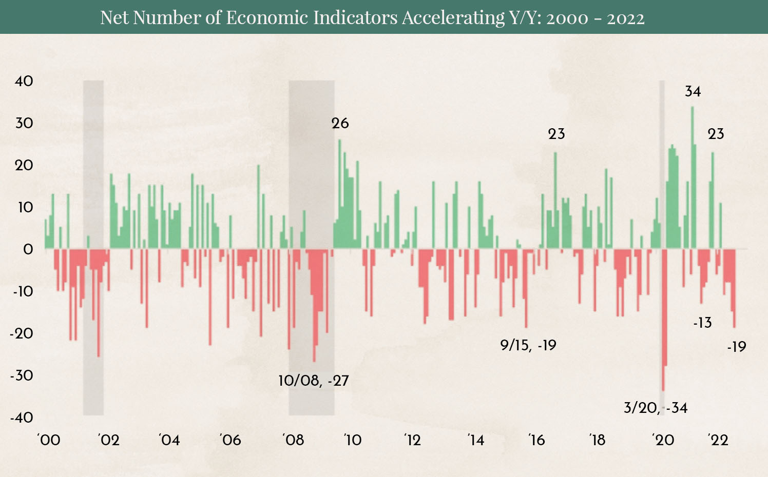
The chart shows the number of economic indicators with positive changes (green) and negative changes (red). Neither the market nor economic development moves in a straight line upward or downward — fluctuations are always part of the cycle. Only during the three extreme cases (the Dot-com Bubble burst, the Global Financial Crisis, and the COVID-19 pandemic) did we see larger negative readings than today. Many have been swept up by the current wave of negative economic news, but a rebound appears more likely than a further decline.
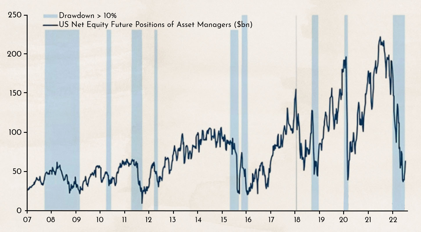
We already showed this chart at the beginning of August, and the figures have not changed significantly as of today. The chart illustrates the positioning of institutional investors through futures contracts. The last time so few large investors were betting on rising markets was at the peak of COVID panic. Fear appears to be greatly exaggerated, and the chart suggests that many major investors are underinvested. By definition, a market crash can generally only occur when investors are overinvested and overly complacent.
Arguments of the Pessimists

The most reliable indicator that a recession is approaching is an inverted yield curve. Only twice in the last 50 years has the yield curve been as negative as it is today — in 1988 following the largest stock market crash in history in 1987, and in 2000 after the bursting of the dot-com bubble. According to the definition of a recession — two consecutive quarters of negative growth — the United States is officially in a recession, although currently a very mild one. The chart points to a crisis similar to 1988 or 2000.
.jpeg)
Oil prices in USD have already returned to levels seen before the war in Ukraine. However, the situation looks different in Europe and Japan. Oil prices in local currencies and local markets are soaring. This is expected to significantly slow economic activity and push economies into a major recession.

Since interest rate hikes began in the United States, growth companies have struggled. Many firms that multiplied in value during the COVID crisis have seen sharp declines. The hardest hit have been growth companies that are still unprofitable and rely on debt to finance their operations. A symbol of an investment strategy focused on such companies is the ARK Invest ARK Innovation ETF, led by investor Cathie Wood. She was one of the biggest stock market stars of 2020 and 2021, but has since lost much of that momentum. What is striking is the similarity between the price performance of the ARK Innovation Fund and the performance of the NASDAQ Composite during the dot-com bubble and crash from 1998 to 2004. If this analysis proves correct, markets may not begin recovering until mid-2024.

Since 1980, interest rates have generally trended downward. Since 1988, they have remained below the average level over the previous 120 months. The last time interest rates moved above this average, it triggered a dramatic surge in rates. Could we be facing the same scenario this time?
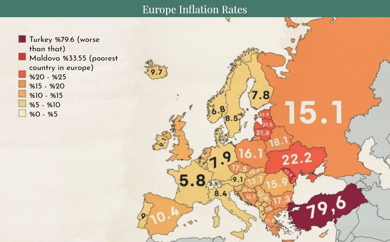
The chart provides an overview of inflation figures across Europe. Levels this high have not been seen in decades. Inflation is not only a consequence of the COVID crisis and the war in Ukraine, but also reflects a 15-year commodity price cycle, the upward phase of which has only just begun. Hence the pessimists’ slogan: Inflation is here to stay.
Is the glass half full or half empty? Let us know your opinion.
Additional image sources: Opening graphic Designed by Freepik
Disclaimer:
The content in these blogs is intended solely for general information purposes and to help potential clients gain an understanding of how we work. It does not constitute recommendations to buy or sell assets and should not be considered investment advice. Marmot Finance cannot assess whether or how the statements made align with your investment objectives and risk profile. Anyone making investment decisions based on these blog posts does so entirely at their own responsibility and risk. Marmot Finance cannot be held liable for any losses incurred as a result of information contained in this blog post.
The products mentioned are not recommendations but are intended to illustrate how Marmot Finance works and selects such products. Marmot Finance is fully independent and does not earn money in any form from product providers.


.webp)





.jpeg)




.jpeg)

.svg)


