
Chart of the Week
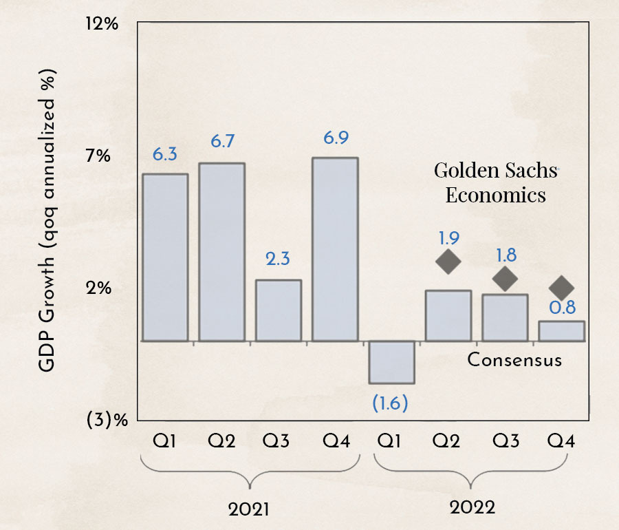
The chart shows the growth of Gross Domestic Product (GDP) in the United States over recent quarters. GDP growth is the most commonly used indicator when assessing the overall state of an economy.
In 2021, the economy recovered well after COVID, but now high inflation is slowing growth.
Why This Matters
In the first quarter of 2022, the US economy unexpectedly contracted by 1.6%. However, growth of 1.9% is expected for the second quarter. The investment bank Goldman Sachs, which is often accurate with its forecasts, expects even stronger growth.
On July 28, the growth figure for the second quarter will be released. If the reported number is negative again, the US would officially be in a recession. This, in turn, would have major implications for the policy of the US central bank. Investors should mark July 28 clearly on their calendars.
Inflation Expectations Decline

The chart shows the breakeven inflation rate. It is a measure of expected inflation, derived from 10-year US Treasury securities with constant maturity and 10-year inflation-indexed US Treasury securities with constant maturity. The latest value reflects the average inflation expectations of market participants over the next 10 years.
In recent weeks, the breakeven rate has fallen sharply. Most investors now clearly expect lower inflation. This would be good news for equity and bond markets. Central banks would no longer be forced to raise interest rates as aggressively.

The chart shows the expected impact of commodity prices on inflation over the next 1.5 years, assuming that commodity prices do not rise further. At present, they are actually falling sharply. Although there is talk of shortages in winter and residents of Germany and Switzerland are already being urged to conserve gas and energy, prices in the markets for oil and gas, as well as wheat and corn, are dropping significantly.
Since the peak shortly after the outbreak of the war in Ukraine, oil is down nearly 30%, gas over 40%, corn 30%, and wheat also over 40%. Most prices are now only slightly higher than before the outbreak of the war.
We find it difficult to interpret this market movement. Is it just a short-term shift because supply levels are not as low as expected, or is it a sign that peace negotiations are already underway behind the scenes?
How long do bear markets last?
Many investors are looking at their portfolios with concern, as they have lost significant value. Since 2009, both equity and bond markets have mostly moved upward. Investors are simply no longer accustomed to declining markets, known as bear markets. How should the current downturn be viewed in a historical context?

The chart shows how the stock market behaved 12 months before a peak and 36 months after. The shaded area represents the range of all declines and recoveries. The dotted line indicates a small bear market (top) and no recession (bottom), while the thick line represents a large bear market (top) and a recession (bottom).
The upper part of the chart shows that a small bear market leads to an average decline of 20%, while a large bear market results in a 40% drop. The current downturn therefore corresponds to a small bear market. In the worst-case scenario, however, it could fall another 20%.
The lower part of the chart shows how the markets behaved after a 20% correction, depending on whether the economy recovered or a recession followed. If the economy recovers, we can expect rising markets. However, if a recession occurs, the market could decline further.
Every published data point that provides insight into the state of the economy is currently being closely watched and interpreted by the markets. The most important figure—US GDP growth—will be released on July 28. In the coming weeks, many companies will report their second-quarter earnings. These could offer an early indication of what to expect on July 28.

The chart shows the gross margins of the 1,000 largest companies in the US in light blue and consumer confidence in dark blue. The two indicators have moved in tandem since 1995. Since these indicators have been measured, there has never been a period where they have diverged for this long.
Given high inflation and rising wages, margins should actually be declining significantly, which would be negative for the stock market. However, consumer confidence is so low that it can hardly go anywhere but up, which would be positive for the market.
Here too, we find it difficult to arrive at a clear interpretation. However, the chart clearly shows that after COVID, and now with the war in Ukraine, the economy has not yet found its “old” equilibrium. This is leading to uncertainty and continued high volatility in the markets.
Disclaimer:
The content in these blogs is provided solely for general information purposes and is intended to help potential clients understand how we work. It does not constitute recommendations to buy or sell any assets and is not investment advice. Marmot Finance cannot assess whether or how the statements made align with your investment objectives or risk profile. If you make investment decisions based on this blog post, you do so entirely at your own risk and responsibility. Marmot Finance cannot be held liable for any losses that may arise from the use of the information contained in this blog post. The products mentioned are not recommendations but are intended to illustrate how Marmot Finance works and selects such products. Marmot Finance is also completely independent and does not earn any compensation from product providers.


.webp)


.jpeg)


.svg)