
Chart of the Week
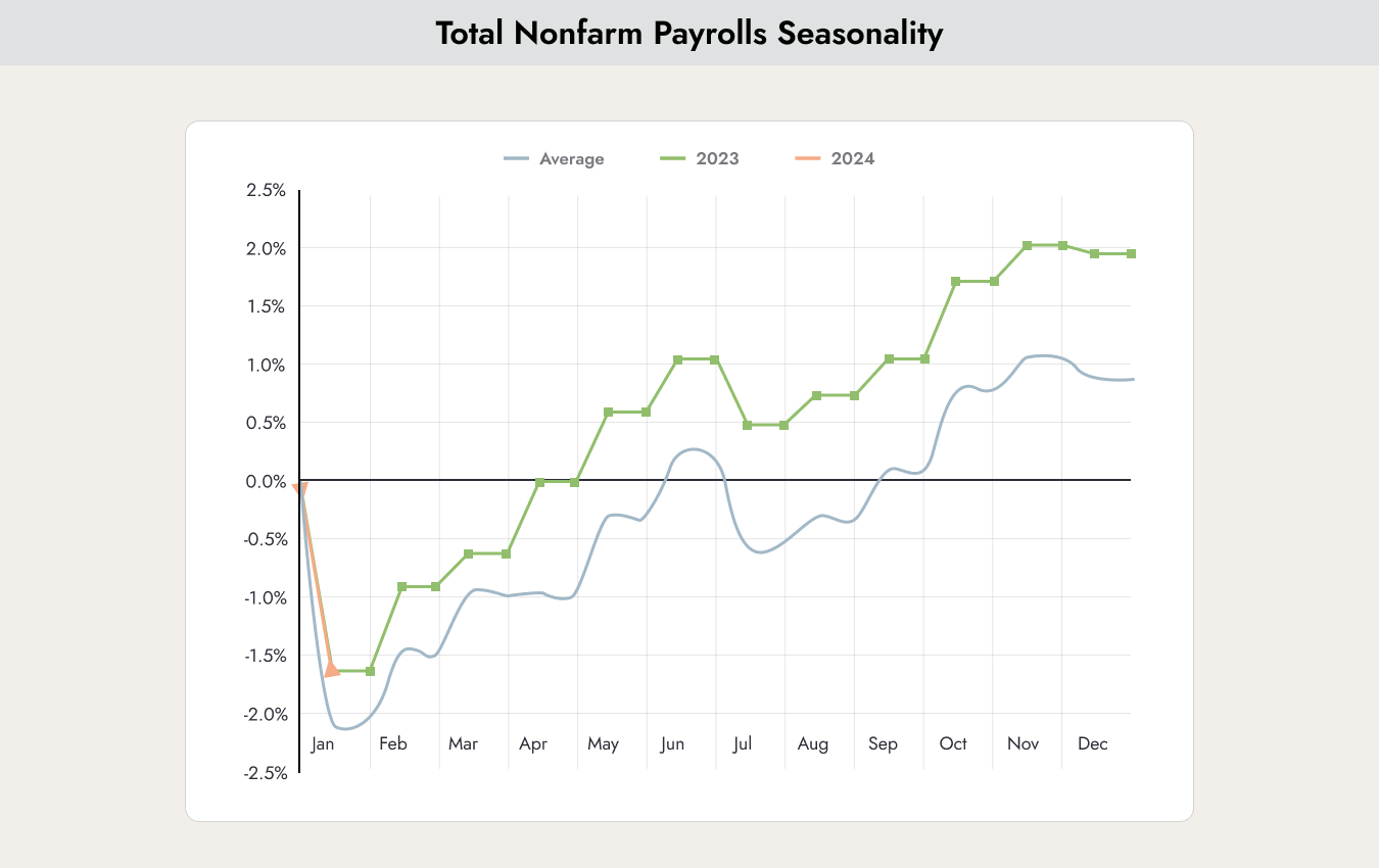
Last week, U.S. labor market data surprised the markets to the upside. Non-farm payrolls surged by 353,000 jobs in January, shattering expectations of an 180,000 increase. While the raw, non-seasonally adjusted head count drops every January due to post-holiday layoffs—declining by about 2.635 million—this drop was actually smaller than the typical 10-year average seasonal decline, proving the labor market remains incredibly tight. This is exactly what the chart above shows.
Why this matters
The chart helps explain why the stock market reacted so negatively to this news. The blue line shows the average change over the past 10 years. As long as the current figures remain above this line, the economy is not cooling down. As a result, the U.S. Federal Reserve is unlikely to cut interest rates as expected.
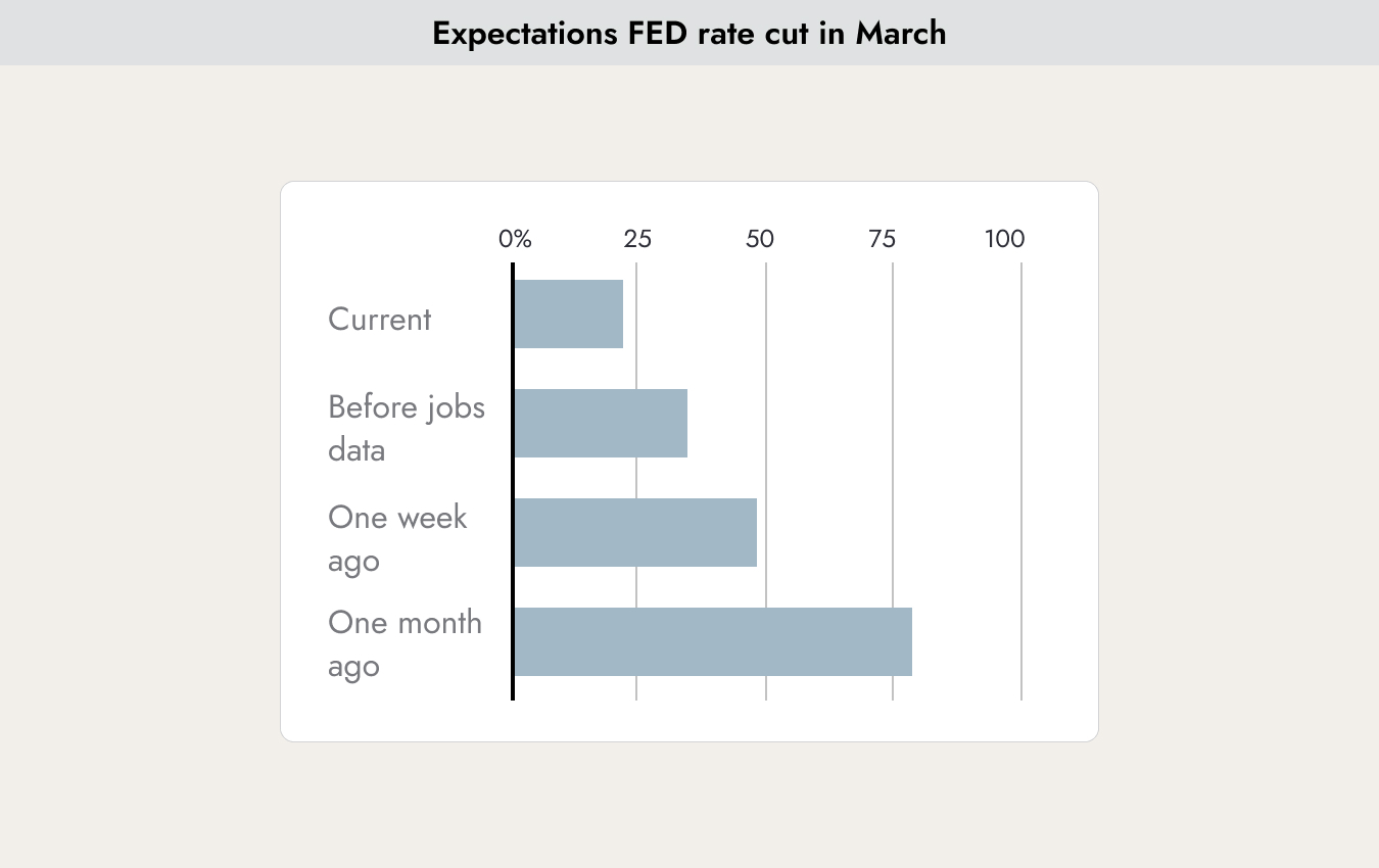
Since the release of the data, investor expectations for an interest rate cut in March have changed dramatically. Just one month ago, expectations stood at 75%; now they are only 25%. Hopes for lower interest rates have driven the stock market in recent weeks. In this weekly report, we have repeatedly pointed out that we consider expectations of seven rate cuts per year to be overly optimistic. Since many companies are exceeding expectations for their fourth-quarter 2023 financial results and providing strong guidance during the current earnings season, the stock market has remained resilient despite fading rate-cut hopes.
Long-Term Bull and Bear Markets
If you filter out the daily and weekly fluctuations, the stock market moves in major cycles. These are illustrated in the following chart.

The upper part of the chart shows the major bull markets (rising stock market) and bear markets (declining stock market).
Two simple memory aids for these terms. I come from Bern, and the Bear Pit is located at one of the lowest points in the city — you go down to the Bear Pit. On the other hand, if a bull charges at you and lifts you with its horns, you go flying upward.
Back to the chart above. Since 1960, there have been 17 bull markets. Market gains ranged from 48% to 169%. In the current bull cycle, markets have only risen by 37% so far. If the market were to turn downward now, this would be the shortest bull market since 1960. Given the strong earnings results companies are currently reporting, this appears unlikely. The bull market could therefore continue for some time.
HOWEVER, now we come to the lower part of the chart. It shows the percentage of stocks that are participating in either a bull or bear market. Currently, the bull market is being driven by only 24% of stocks in the market. This is the lowest level recorded since 1960 — even lower than during the major crisis of 1973 or the tech bubble in 2000. For the rally to continue, more stocks need to support this bull market movement. Otherwise, it could indeed become the shortest bull market since 1960.
Company Valuations
When is a company considered expensive, and when is it considered cheaply valued? Last week, Apple announced a quarterly profit of USD 40 billion. Is the stock price of USD 188 justified or not?
There are many methods to calculate the value of a company and assess whether a stock is expensive or cheap. One of the best-known metrics is the Price-to-Earnings Ratio (P/E Ratio). The P/E ratio is calculated by dividing a company’s current stock price by its earnings per share.
This calculation can be done using current figures, but also with earnings estimates. In that case, the metric is called the “Forward P/E.”
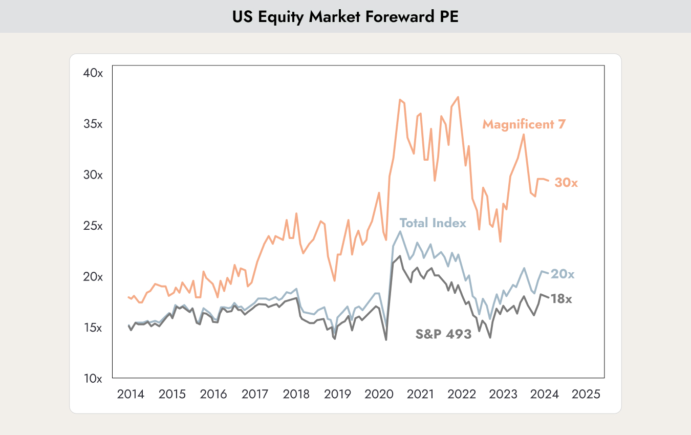
The chart shows how the Price-to-Earnings Ratio of three indices has changed since 2014: the S&P 500 (grey line), the Magnificent 7 stocks (light blue line), and the S&P 500 excluding the Magnificent 7 (dark blue line: Apple Inc., Amazon, Alphabet Inc. (Google), Meta Platforms (Facebook), Microsoft, NVIDIA, and Tesla, Inc.).
Over the past 10 years, the S&P 500 has traded at a P/E ratio of between 15 and 20. This means that the average stock valuation has ranged between 15 and 20 times a company’s annual earnings.
If an investor buys a company today, the company would need to generate at least the same annual profit it earns today for more than 20 years before the purchase price is recovered and the buyer starts making a profit. With companies like Nestlé or The Coca-Cola Company, one might feel confident making a 20-year forecast. With a company like Netflix, the situation is quite different.
NVIDIA, one of the Magnificent 7 companies, is currently trading at a P/E ratio of 90. Would you be willing to bet that the company will generate at least the same level of profit as last year for the next 90 years?
The chart above also highlights how absurdly high the valuations of the Magnificent 7 have become. Here, valuations have significantly detached from reality.
The calculation of the P/E ratio is based on companies’ reported earnings. These earnings can be relatively easy to manipulate. Acquisitions, mergers, and write-downs can distort the figures. Robert Shiller, the Nobel Prize-winning economist, developed a version of the P/E ratio that adjusts for these distortions. It is also known as the cyclically adjusted Price-to-Earnings ratio.
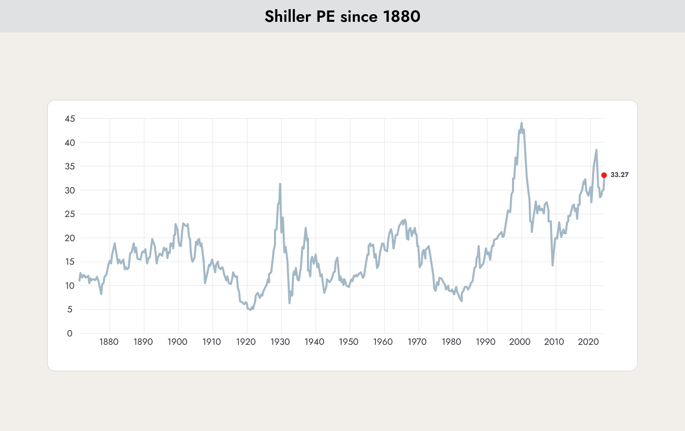
The chart shows the historical development of the Shiller P/E ratio since 1880. The current value of 33.27 is very high, but not the highest level ever recorded. Market pessimists often use the elevated Shiller P/E ratio to justify their negative outlook on the markets.
The following table shows a broad selection of valuation metrics for companies.
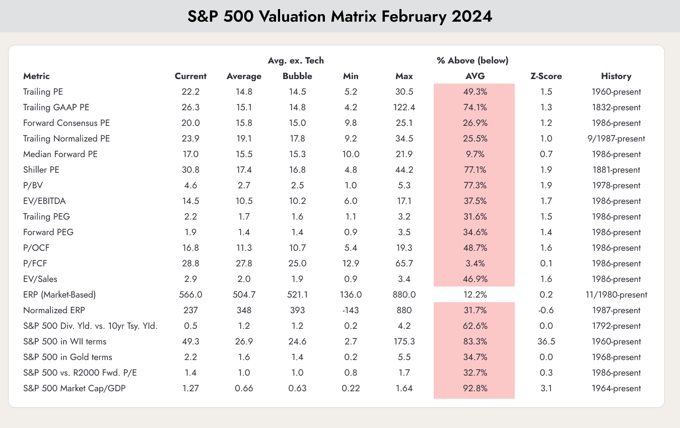
Overall picture: the “Min” and “Max” columns show the lowest and highest values each valuation metric has ever reached. The most interesting column is “% Above Avg,” which indicates whether the valuation metric is above or below its historical average.
Almost all valuation metrics are currently trading above — or even well above — their historical averages, but they are still far from their all-time peak levels.
For us, this is not a reason to panic and sell all stocks, but caution is still warranted. We remain fully invested, but feel more comfortable with conservative value stocks such as Nestlé or The Coca-Cola Company than with NVIDIA.
Also interesting in this context is the following chart, which illustrates the risk premium for stocks.
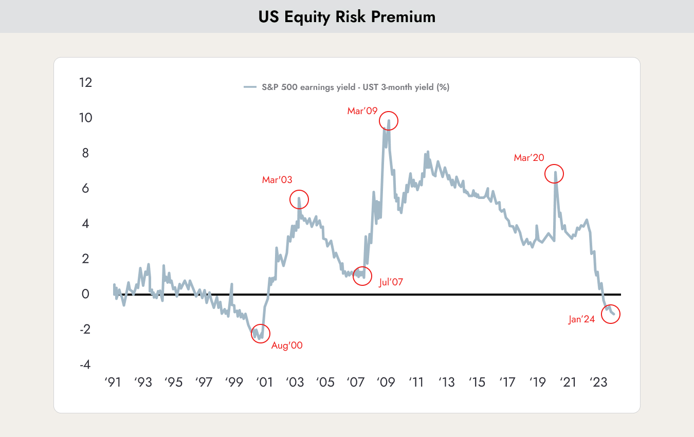
The chart shows the equity risk premium of the S&P 500. It is calculated by subtracting the yield on the 10-year U.S. Treasury bond from the S&P 500's earnings yield.
The earnings yield is based on earnings per share over the past 12-month period, divided by the current market price per share. Earnings yield (the inverse of the Price-to-Earnings ratio) shows the percentage of earnings generated per share of a company.
A near-zero or negative equity risk premium means that the earnings yield of the stock market provides little to no extra return cushion over the guaranteed yield of risk-free government bonds, signaling that equities are historically expensive relative to fixed income.
The only time the risk premium was even lower was during the dot-com bubble in 2000. However, we also saw similar levels in 1997, and the market correction did not come until three years later. Once again, the picture is the same: no reason to panic and sell stocks, but caution is still warranted.


.webp)





.jpeg)




.jpeg)

.svg)


