
Chart of the Week
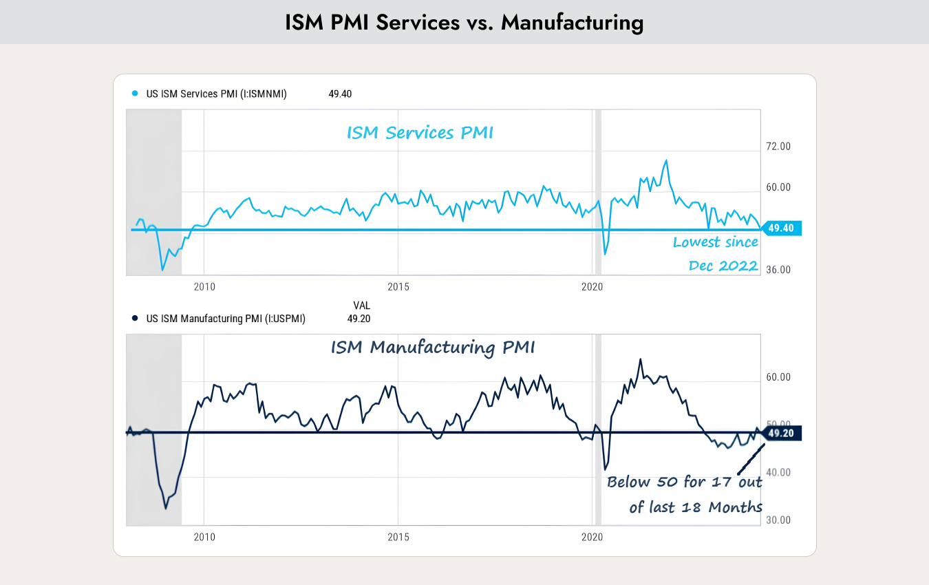
The chart shows two surveys of purchasing managers from companies in the manufacturing sector (ISM Manufacturing PMI) and the services sector (ISM Services PMI). These two indices have historically had strong predictive power regarding the future direction of the economy and are therefore among the most closely watched leading economic indicators. A value above 50 indicates economic expansion, while a value below 50 indicates economic contraction.
Why this is important
Over the past 15 years, the share of the manufacturing sector in total gross domestic product has steadily declined. It is now 35%. However, the share of the service sector has risen to 65%.
As the chart above shows, the manufacturing industry has been contracting for 18 months, meaning it is in a recession. However, the service sector is not. Due to its higher weight, the overall economy has therefore continued to grow.
This illustrates the dilemma facing analysts. Most leading economic indicators are based on manufacturing data and are predicting a recession, but the majority of companies are doing very well and corporate profits are rising.
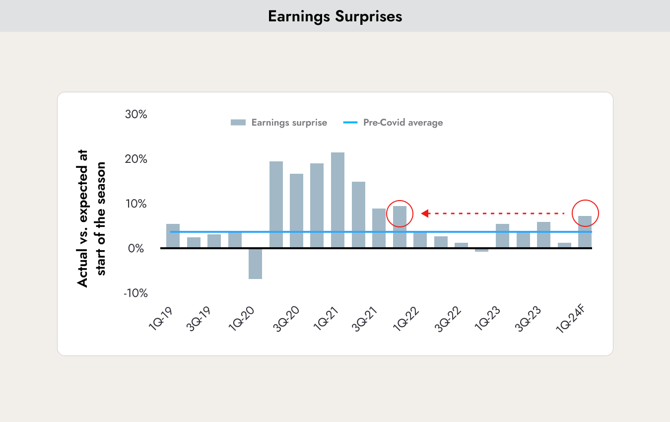
The chart shows the end of the earnings season for the first quarter of 2024. Profits increased by an average of 8%. An increase of 3% had been expected. The economy remains surprisingly strong, and no recession is in sight.
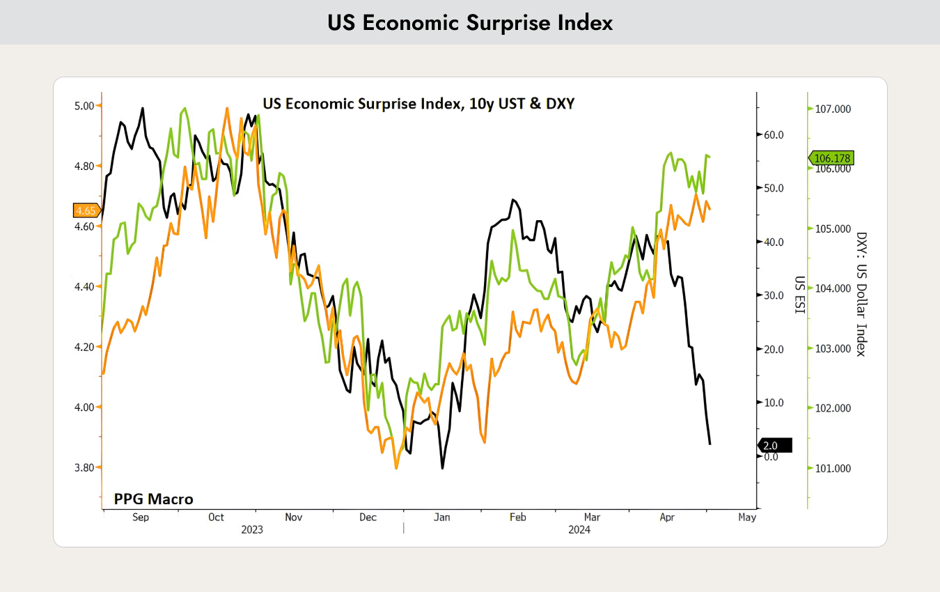
In contrast to the strong earnings season, the US Economic Surprise Index (black line) is declining. The Economic Surprise Index represents the sum of the differences between official economic data and analysts’ forecasts. If the value is above 0, economic performance generally exceeds market expectations. If the value is below 0, economic conditions are generally worse than expected.
The index has been losing significant value since the beginning of April. The economy is cooling down. As the chart above shows, 10-year bond yields (orange line) and the USD (green line) have mostly moved relatively in parallel. If this correlation continues, the USD in particular should lose value against other currencies.
Currently, the manufacturing PMI is recovering again, but now the services sector, which has so far been a solid pillar, is starting to weaken. This is currently causing very volatile market movements. Analysts’ opinions are strongly divided. In such a situation, it is advisable to remain cautiously invested and not to take on too much risk.
Should one sell in May?
One of the most well-known stock market rules says: “Sell in May and go away, but don’t forget to come back in October.” So it is sufficient to be invested only from November to April, while the rest of the year one can hold 100% cash.

The blue part of the chart shows how an investment of USD 10,000 would have developed since 1957 if one had always been invested from May to October. The red part shows how USD 10,000 would have developed if one had always been invested from November to April. The difference is enormous.
There are various explanations for why this is the case:
- In the summer months, many people are on holiday and trading volumes are low.
- Companies rarely surprise with new product announcements. These usually come later for the Christmas season and are presented in the autumn.
- Large service contracts are included in budgets in November and awarded in the spring. As a result, there are few new impulses (or positive surprises) from companies.
However, over the past 5 years, the difference in returns between the two strategies has significantly decreased.
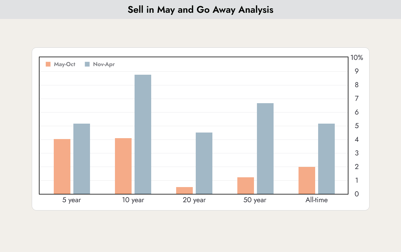
If one examines this relationship using data from the past 50 years, the return difference between May to October (red bars) and November to April (blue bars) was almost 5.5% per year. However, if one looks only at the last 5 years, the difference is reduced to about 1%.
The data above comes from the United States. The effect is not equally strong in every country.

The chart shows in which countries the “Sell in May” effect is strongest. These are mainly the countries on the right side of the chart above. In Switzerland, Germany, as well as Norway and Greece, the effect is very strong. In contrast, it is weak in Finland, Australia, and New Zealand. No conclusive explanation for these differences can be found.
The fact is that the effect occurs in all countries. There is no country where summer returns are higher than winter returns.
The figures are always average values. When looking at individual years, the effect occurs in 8 out of 10 years, making it a very stable pattern as well.
Most of the exceptions in which the effect does not apply in the United States occur in election years. This year, there are elections in the US. The explanation is that during the election campaign, candidates make many promises, which leads to positive impulses from politics.
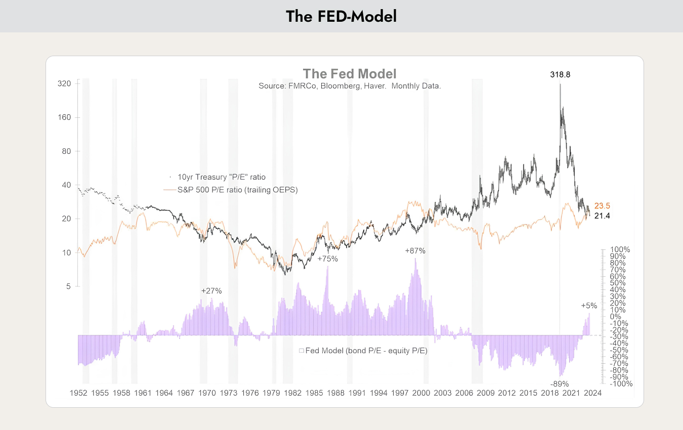
The model owes its name to former Fed chairs Greenspan and Powell, who often referred to this model when explaining interest rate decisions. It is not known whether the central bank still actively uses this model today.
The “Fed Model” or “Fed Stock Valuation Model” (FSVM) is a theory of equity valuation in which the expected earnings yield of the stock market is compared with the nominal yield of long-term government bonds. The theory states that the stock market as a whole is fairly valued when the expected one-year I/B/E/S earnings yield equals the nominal yield on 10-year government bonds.
The black line shows the P/E of government bonds, and the red line shows the P/E of equities. The bars in the lower section show the overvaluation of bonds (in the negative range) or their undervaluation (in the positive range).
From 2003 to 2023, equities were valued at a lower P/E and were therefore the better investment for investors. However, the situation has now reversed. Bonds are currently more fairly valued than equities and should therefore have a place in every portfolio.
The current situation also has disadvantages. Whenever the bar chart in the lower part of the graph is in positive territory, meaning bonds are better valued, there is a high correlation with equities. Bonds rise and fall in sync with the stock markets and no longer provide diversification.
Therefore, higher volatility in portfolios should generally be expected in the coming months and years.
The risk for investors in such a market environment is that they take on too much risk, because stocks and bonds no longer complement each other as well as they did over the past 20 years.


.webp)





.jpeg)




.jpeg)

.svg)


